
UX & Design
10 beginner tips for designing TV streaming apps.
February 2, 2023
They say the best user interface (UI) design is the one that goes unnoticed, but doing this successfully is much harder than it looks. At REDspace, we’ve helped build cutting-edge streaming applications that deliver content to millions of people all over the world. To help you get started, we’ve come up with ten tips that will point you in the right direction.
1. A room with a view.
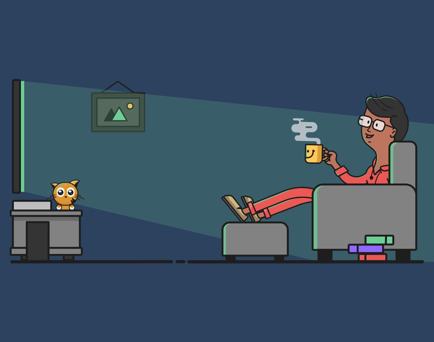
We all love to sink into our sofa to watch our favorite shows and movies from the comfort of our living room. For optimal viewing, this is usually about three meters from the screen.
As designers, it’s important to factor in the viewing distance when placing text in a TV app’s design. The text must be readable from three meters away, which means sizes need to be much larger than they would be for mobile apps held in your hand.
There are slightly different size recommendations for various platforms but the average recommended minimum text size is 24px for nonessential text. The font you choose will determine if the text size needs to be larger. If you’re not sure, it’s best to test your design on multiple televisions from different distances.
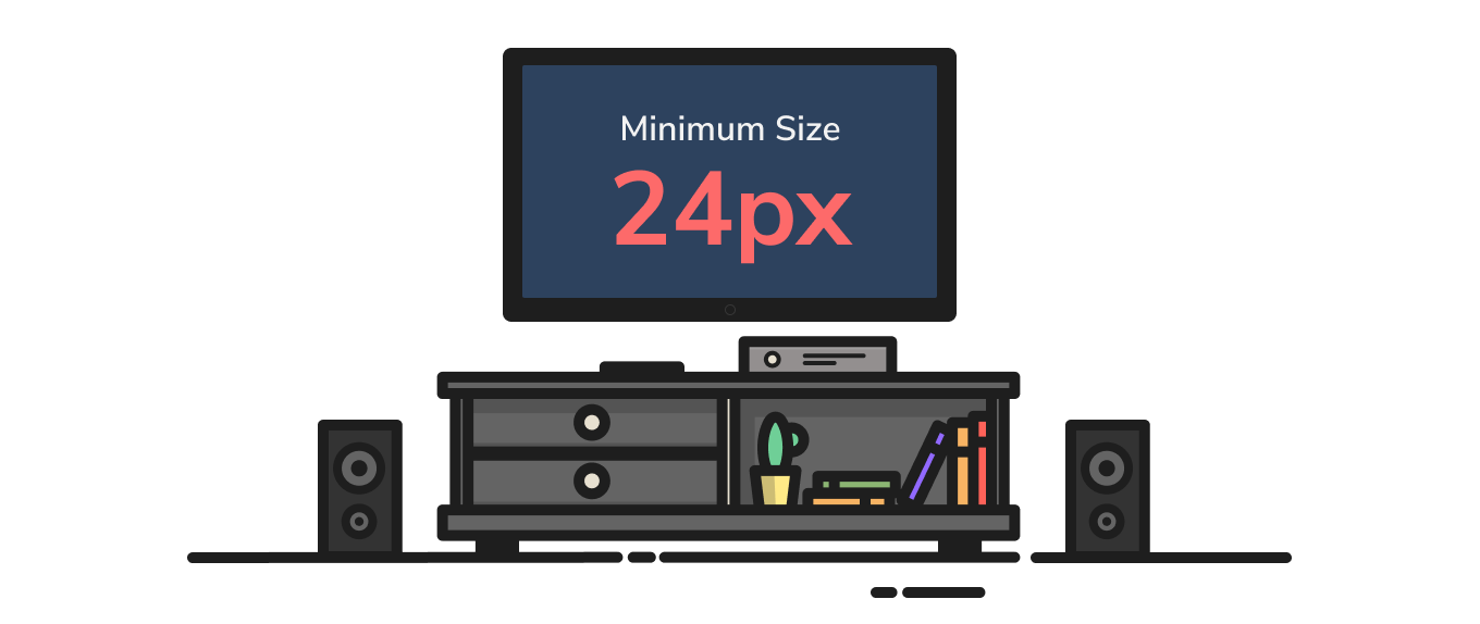
The minimum recommended text size on TV.
2. One size to rule them all.
There are so many TV screen sizes available. Luckily, manufacturers have agreed upon an international standard aspect ratio of 16:9. This allows us to scale our designs proportionally so they will fit nicely on multiple television sizes.
We recommend you design your app using a 1920px x 1080px screen size. This sizing ensures that all elements can be easily resized for HD or 4K screens.
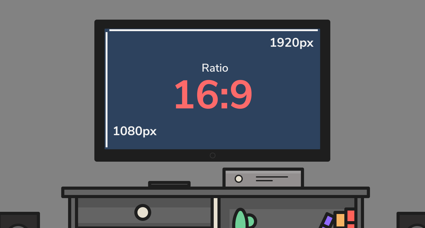
Screen size used when designing TV UI.
3. Highway to the safety zone.
There are many different TV platforms (Android TV, Apple tvOS, etc.); each with slightly different safe zones. The key to a great user experience is to make sure your UI falls within this safe zone so it doesn’t get cut off by different sized screens.
As a general rule, platforms use a 5% margin or a distance of around 60px x 90px from the edge of the screen.
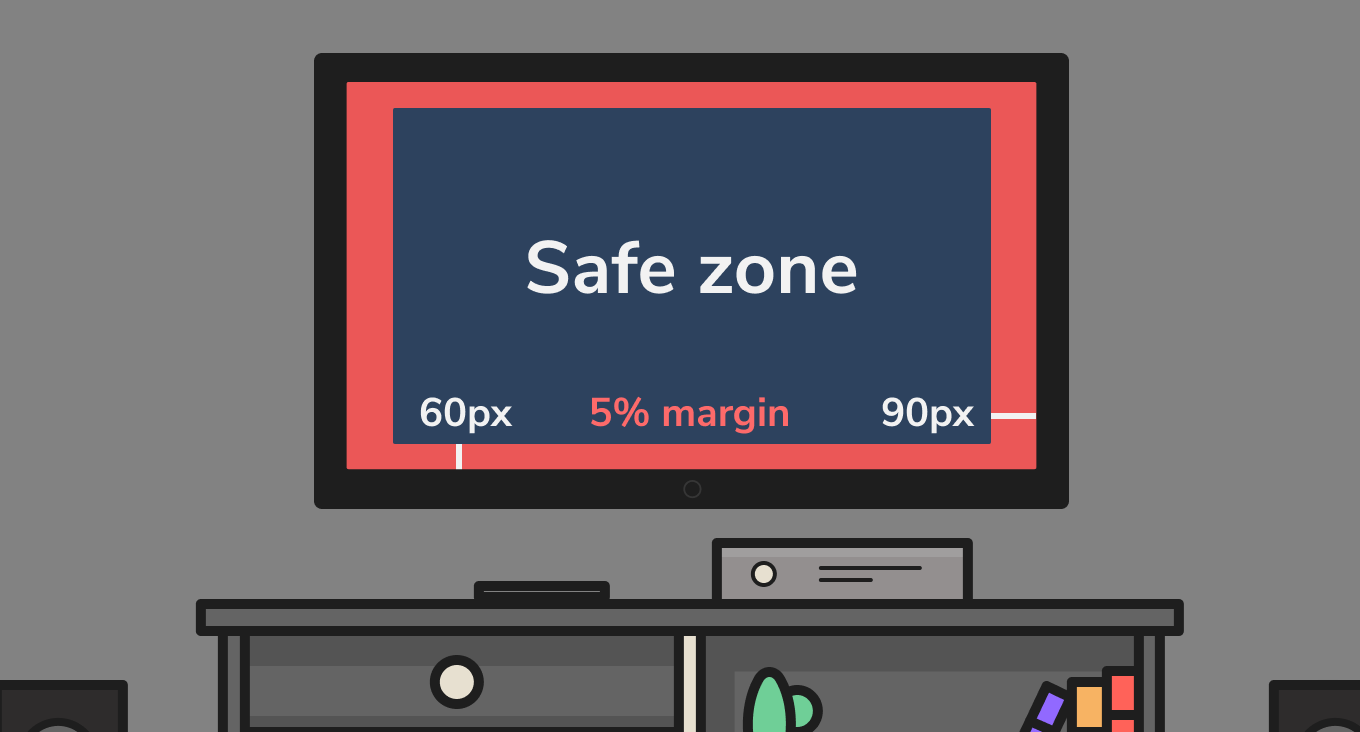
TV safe zones.
4. It's a colorful life.
When choosing the colors for your app, keep in mind that TVs only display RGB color values between 16-235. This means your client’s brand colors may have to be adjusted slightly to fit well within this color range.
Follow these color tips to keep the eye doctor away:
- Extremely high-contrast colors on television screens can be hard on the eyes.
- A white or bright background will be difficult to look at in a dark living room. It’s by design that most popular TV apps use dark backgrounds and rarely use light or bright colors.
- Cool colors bleed less on a TV screen than warm colors.
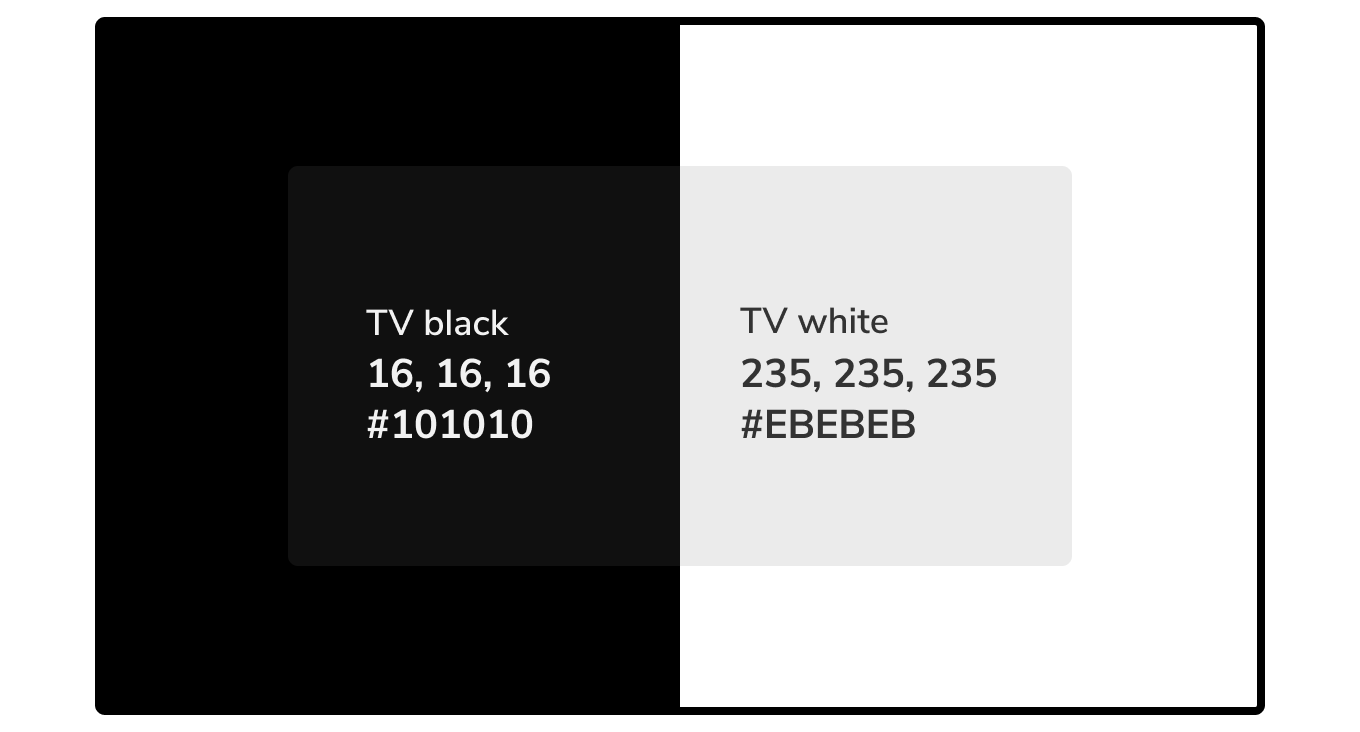
Black and white values that are safe for TV use.
5. Ups & downs.
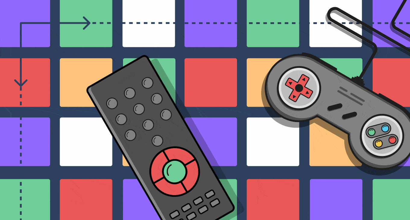
When you navigate an app on a TV you use a D-pad (directional pad) on a remote or a game controller. These controllers have standard “OK” and “back” buttons. While they may have different names, we expect these “standard” buttons to work the same in each app.
To avoid confusing your users, follow these navigation tips:
- The microphone button on a remote allows you to search.
- The home button takes you to the app’s home screen.
- The back button returns you to the previous view. (The menu button often has the same function.)
- Layout content in rows and columns to easily navigate with the D-pad.
Layout content in rows and columns to easily navigate with the D-pad.
6. Hocus focus.
Unlike mobile devices, TV screens can’t be navigated with touch. This hands-off interaction creates a few navigational hurdles. To combat these hurdles, it is important that your design shows which element on screen is in focus (selected) at all times. Keep these key things in mind when designing the focus state:
- If you walk away from the television and didn’t see the focus state change, you should be able to identify the selected element.
- Show focus changes with a transition between focused and non-focused states.
- Use sounds to indicate when the focus has changed.
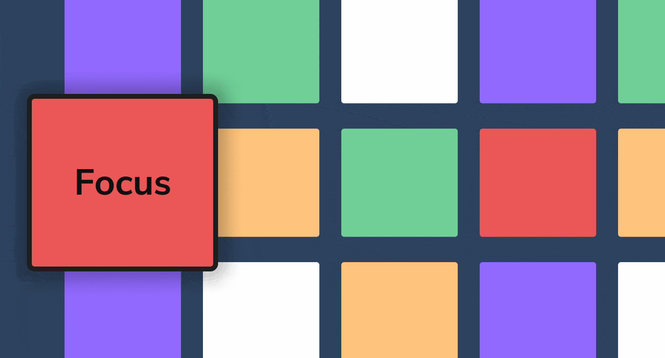
Show which element is in focus.
7. Behind density lines.
Another side effect of the TV viewing distance is that it’s harder to process as much information as you would on a mobile device. Limit the amount of text and reading in your TV app UI. Keep content short and sweet—say more with small amounts of well written text.
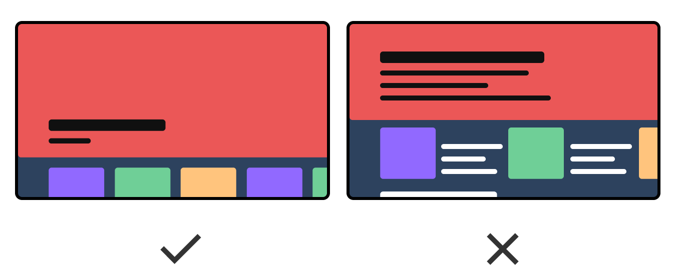
Reduce content clutter.
8. Blurry Business
Modern TV screens use progressive scan video content that displays even and odd lines of pixels at the same time. When you have lines and shapes in your design, it’s important that their pixel size is divisible by one. For instance, a line that is 1.35 px has to be rendered across multiple pixels, resulting in a blurry line. Stick with line widths of 1px, 2px, 3px, etc. for the sharpest image.
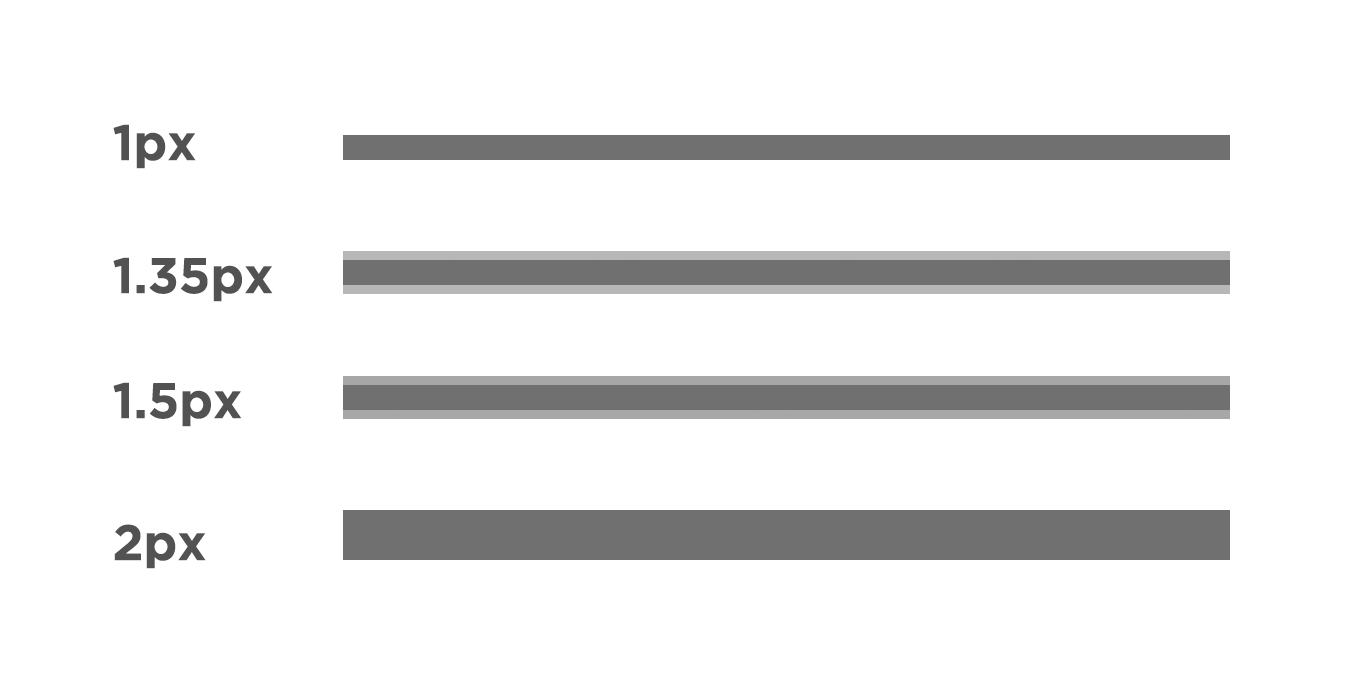
Line widths divisible by one will provide a sharper image.
9. The outer limits.
“Arghhh, don’t make me use a remote to type.”
People may be willing to browse a streaming app for hours to find the perfect thing to watch, but their patience for typing with a remote is very small. Here are a few strategies to limit the amount of remote typing needed:
- Search results appear as you type.
- Allow an option for voice search when available.
- The login process can be done through a mobile device with a friendlier keyboard.
- Save usernames and passwords to minimize how often users are required to type.
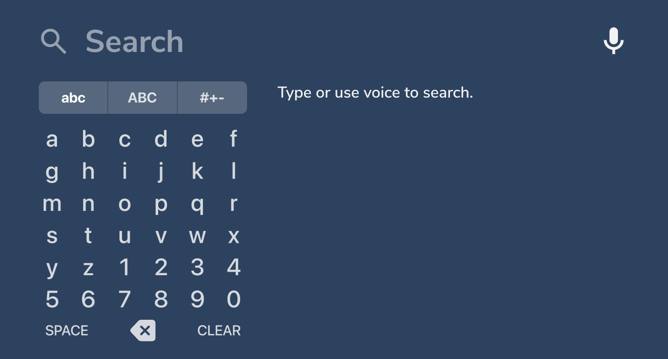
Search results appear as soon as you type.
10. Clear and platform danger.
It can be scary trying to design for the various platforms out there. Luckily, almost every platform has its specific development and design guidelines. Many of them follow the tips listed above.
Once you know what platforms your app will be built for, check out the platform-specific guidelines.
Here are a few of the top platform guidelines:
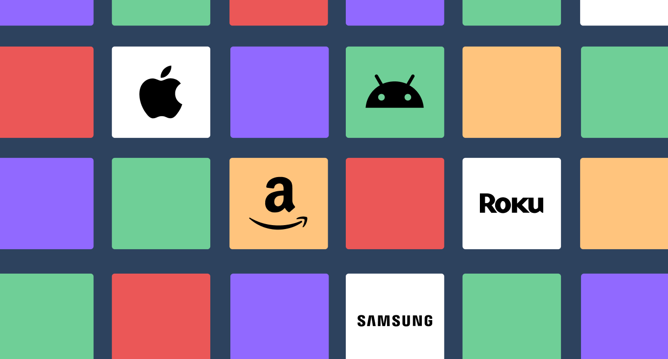
A few TV platforms you may have to consider when designing your app.
To be continued…
While we’ve only scratched the surface of designing video streaming apps, we hope these tips give you a better understanding of things you should consider in 2023. The streaming landscape is showing no signs of slowing and is an exciting space! Because of this, we should all expect major changes to UI expectations as the technology continues to evolve.
Have a streaming app you need help with?
Bring your content to audiences everywhere with our custom streaming solutions, designed for companies at any stage of their evolution.


Bring your vision to life.
There’s no better time than now to bring transformation to your industry. With multiple options available to build a collaborative relationship, solving big problems and connecting with your audience can be easier than ever.
